
Revamping the Design System for FD
Seven years ago, I had the incredible opportunity to create one of the first digital design systems for 'Financieele Dagblad' (FD), a leading financial newspaper in the Netherlands. At that time, we were navigating the early days of digital design using Sketch.
As design trends and tools evolved, I felt it was time to revisit and refine this project with the expertise and capabilities I’ve developed since then.

The FD newspaper’s iconic salmon pink paper presented a unique challenge when transitioning to digital—maintaining adequate contrast for accessibility.
Analyzing the current FD website revealed several contrast issues, making parts of the site difficult for people with visual impairments to view.
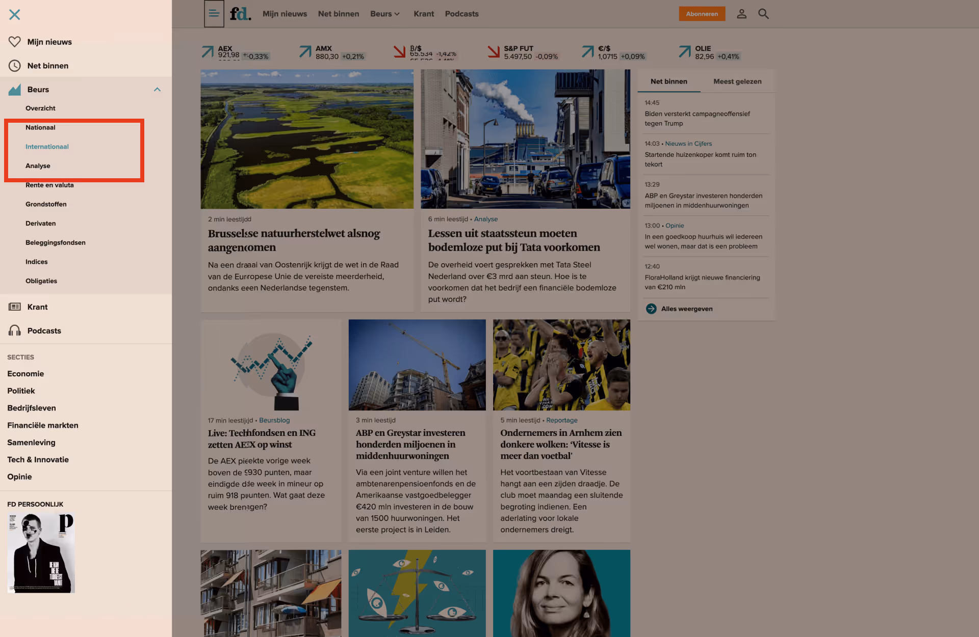
For example, the sidebar menu with a darker background clashed with the brand’s blue color, and the green text used to indicate positive stock numbers lacked sufficient contrast.
To address these issues, I started with UntitledUI, an incredibly versatile design system I often use as a foundation for my projects.
For those interested, I’ve included a link to download a free version of UntitledUI and explore it yourself.

Color Palette
The first major task was to fix the color palette, especially the challenging salmon pink. I gathered screenshots from the current website to establish a baseline. Interestingly, the website used two different background colors—darker on the homepage and lighter on article pages.
Using tints.dev, I experimented with various tints and shades to achieve the right balance.
The brand’s blue color was more straightforward, but I used a slightly darker tint for success, warning, and error colors to enhance visibility.

It was quite a search to find that classic Serif font, but it was more condensed, meaning there was more room for text on mobile.
Typography
Next, I tackled typography. FD traditionally uses Arnhem, a strong but wide-serif font. I opted to keep a serif for display purposes but chose ‘PP Editorial New’ for a more condensed look. Although it lacks a semi-bold or medium weight, it serves the design well.
FD uses Proxima Nova for regular text, but I chose to stick with Inter from my design system for a cleaner, more modern feel.

I meticulously reviewed and adjusted the effect styles, spacing, radius, and grids. This wasn’t a hole-in-one process; it required digging through the variables to set the right tints and shades for various elements.

The revamped design system respects FD’s iconic look and significantly enhances accessibility and user experience. The meticulous adjustments and fine-tuning resulted in a more visually appealing and user-friendly digital platform.

Revamping the FD design system was a challenging yet rewarding project that pushed my design skills to new heights. The updated design ensures that everyone can access and enjoy FD’s content regardless of visual ability.
This project exemplifies my commitment to creating world-class UX designs that elevate digital platforms.


